|
Yes, I have been AFK recently on the blog. I do have a couple posts queued up, but they nee some more refinement. In addition, most of my nerd free time has been dedicated to completing my CPE credits to maintain my CPA certification. The courses I am currently taking are:
One of the fun questions Tim Ferriss asks his guests on his 4 hour work week podcast is What’s one item you’ve purchased in the past six months for under $100 that’s had the biggest positive impact on your life? Here are mine in no particular order.
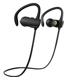
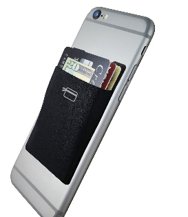
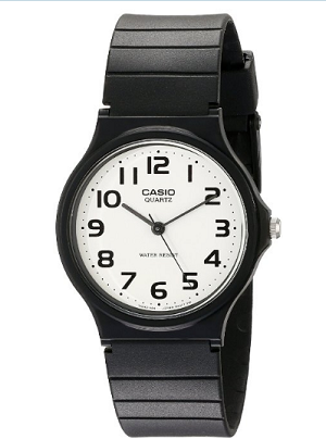
1. CardNinja (Card Wallet for Cell Phone): $8. As a NYC commuter, you live and die by the card. From metro card to credit card, to Corp ID card. This $8 purchase has made my life SO MUCH easier. I recommend not putting more than 3 cards in there since the purpose is NOT to replace your wallet, but rather a quick way to get your most frequently used cards out. Also, I am more likely to forget my metro card than my cell phone, but since the metro card is now WITH the cell phone, I never have to worry about it. 2. SoundPEAT Bluetooth Headphone: $23. These are the best. Long battery life, super light weight, great sound and fits any ear shape. If i somehow forget to bring these to my daily workout at the gym... i seriously consider not doing anything since I love my music and these headphones. 3. Gymnastic Bodies: $99+ Specifically I did the Handstand course, but you will see there are many others. What is great about Chris Sommers (creator) is that he expects you to not just "do" the exercise, but to MASTER IT. Therefore the workouts are stair stepped from a very beginner level stretch all the way to a 10 minute long hand stand. It is very cool to understand the underlying muscles and mobility needed to accomplish the final goal of a handstand. What is even cooler is seeing your progress! My next workout I will buy is a SPLIT mobility course...I always wanted to be able to do a full split. 4. Casio wrist watch: $10 You just can not go wrong with a Casio watch. I went from a fitbit that died a couple months ago to this watch, and I have to say, I do not miss the fitbit that much. This little sucker tells the correct time, water proof, light weight, durable and cheap. If I lose it, scratch, decide I want a new color; it is $10 for a new one. I am in the hunt for a spring break vacation with the family so I am searching "where in the world" should we go. I came across the British Airways website and immediate got a chuckle: 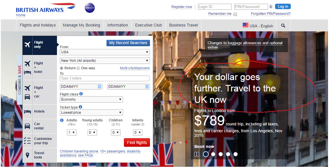 Now, I can not tell if they are saying that my dollar will go further because BA is offering me such a great deal... or that their home town (my birthplace) is taking a beating on their currency: 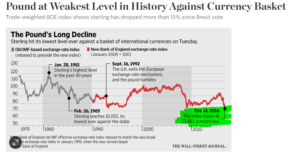 Either way, they are right! But I think we will pass on the UK, i mean England. We are eyeing Bali, Hawaii or dare I say it... Disney World.
In case you have not heard, Panasonic recently announced an awesome upgrade to their great G7 camera; the new G85: https://www.dpreview.com/reviews/panasonic-lumix-dmc-g85-first-impressions-review I knew I wanted this, but that would mean I would have to sell my G7 which came with a 28-280mm lens. Amazon would buy back this camera kit for a very fair price and I would take those funds to buy the new G85 with the included 24-120 lens. The problem is that I LOVE the reach of the 280mm and not sure I could replace it with a lens that could only reach 120mm in distance. At the same a 24mm range for the new lens is a HUGE difference in getting a wider angle shot. Here are some examples of the different zoom ranges I took this past year: 28, 60, 280: The big question was: Do I really even use the lens at the zoomed in range? Let us Find out! In order to do so I went into the past year's worth of photos that are were marked as "5 Stars" meaning these photos would be printed out at the end of the year in my annual photo book. I then copied the metadata of these shots into an excel document. 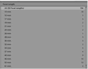 The next steps were to figure out what graphic representation can best convince me that I fully utilize my 28-280mm lens to it's full potential. 1. A very straight forward breakout of all of different focal lengths and the # of shots taken at each one. 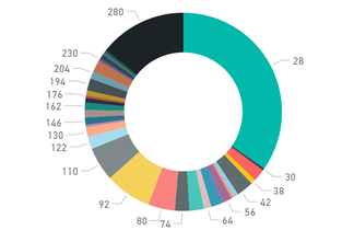 I can obviously see the two most used focal length were the very wide shot @ 28mm and the long shot @280mm. Overall this is too much information, lets group all the focal lengths into the potential new lens which would be 28-120mm and then the extra length of the current lens which would be 121-280mm. 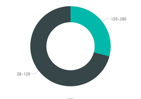 Much better. I can now easily see that 70% of my shots would be satisfied with the new lens. At the same time, I feel that I still do not have a sense of my shooting habits related to the different focal lengths; and this is where the Pareto comes in to the save the day: 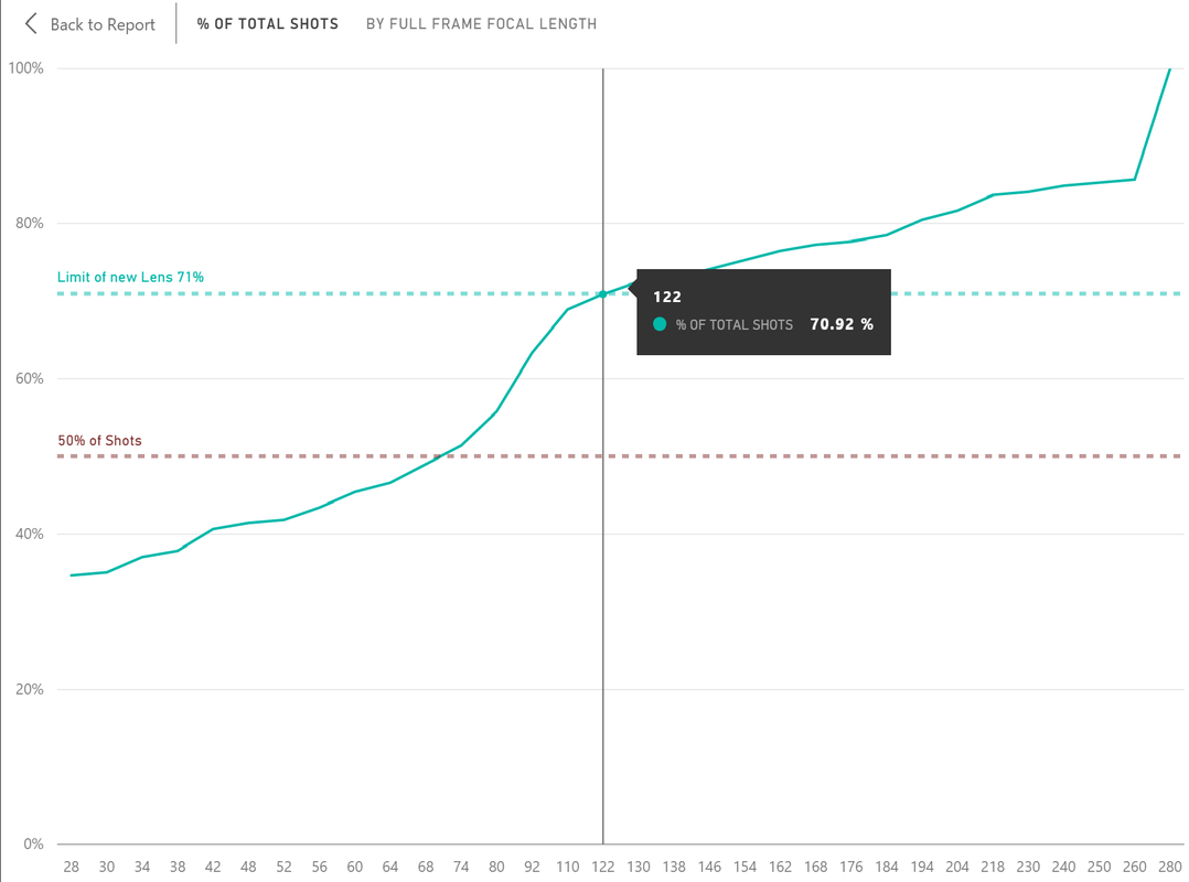 This graph really helps me understand the rate of photos I take relative to the maximum focal length I have available. After the data, I was curious to see which 5 star pictures were shot at the longest 280mm length. I cringed, because the majority of them were all AIRPLANE shot from two airshows I attended. DOH! I mean, the shots are great! But I really should have removed them since they are a subject I could care less about in getting "that shot." (Plus I have another camera system for that kind of work). Doing this exercise supplied me with a big surprise in that I fully thought most of my shooting was done at the long focal range. The data shows that since the majority of my shots were taken at the widest angle of 28mm, it questions how many shots could have been "better" or photos that were missed since I did not have a wider lens like a 24mm lens. So I sold the G7 and 28-280 lens to amazon, got the cash and now I am just waiting for the new camera and lens to be released! The Power(BI) of the Accumulative formulaOne of the primary formulas that was needed to create all of these graphs was the DAX accumulative formula which I have a separate posting on. This is one of the most basic formulas, yet by understanding the details, it helps unlock the mystery of the "evaluation contexts."
I recently attended the Budweiser Made In America Music Festival in Philadelphia, PA and one sponsor really caught my eye: Tidal (The streaming music service). They did a great job promoting their product from interactive tents to having one of the stages named "Tidal". The thing that tipped me over was that they were recording the entire festival, every stage with what looked like very high end video gear. We are talking dollies, cranes, perches, zooms in the back... let us just say it looked very expensive. As a paying Spotify customer I went home and signed up for the free Tidal trial, looked at the concert videos and honestly have not logged back on in almost 2 weeks. WHY!? I really could not see the value let alone the "extras" that would have me leave Spotify. The concert videos were "eh" and it made me realize that watching "Live Concerts" are HORRIBLE compared to the real thing. And as far as the underlying product I am consuming, both services provide the same thing: music to my ears. Loving Tidal's advertising at Made in America, trying them out, yet never signing up for their service got me thinking of the book, 22 Immutable Laws of Marketing which is now 22 years old(1994), yet reads like it was published this year. I took my own thoughts on the two companies to see how they stacked up against the 22 laws: 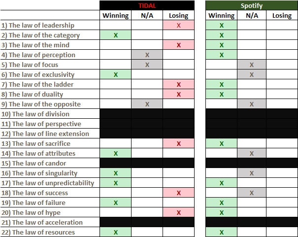 One thing that stuck out was that in my opinionated analysis, Spotify is doing AMAZING, but I will get to one aspect that authors Al Ries and Jack Trout did not anticipate in the crazy no profit billion dollar valuation games.
As far as Tidal, I think 3 huge laws that they have broken will pretty much explain why they will most likely have to fold in the coming months/years.
Since 1968 (Official consolidation of New York City transit services) there have been 12 MTA Chairman, which means only average each one served 4.1 years. Since 2007, the average has been 2 years! 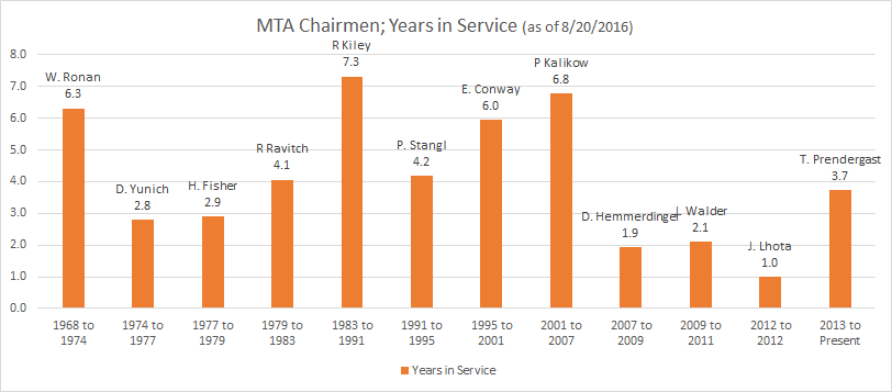 Poor J. Lhota: 1/9/2012 through 12/31/2012. He probably was not even able to witness a Purchase Order go through and see it delivered.
Being the CEO at the MTA, is very different than being a CEO for a Public Company. The primary reason is because the MTA Chairman is the position that links all of the operating agencies together (LIRR, MNR, NYCT, MTA Bus, Bridge and Tunnel). Without the chairman, there can be no consolidation of operations and effecienies. In 2016, the MTA is finally starting to combine procurement offices; no one needs 5 different people buying pens and pencils from 5 different vendors. So when you have that kind of turnover over a 5 year stretch from 2007 through 2012, you have delayed that process of trying to get everyone on the same page. Thankfully the current CEO, Tom P. has been in the position for over 3 and half years (plus decades running other transit operations) and the NY Governorship will not be changed until 2018 which means Tom should be able hit 6 years in the position and provide much needed continuity to the MTA as well as push long term projects that would not be possible with leaders that last only 1 to 2 years. I have seen a couple of examples where industries or departments show a KPI where it always hovers around 99.7% to 99.9%. Almost all the time the KPI chart will look like this: 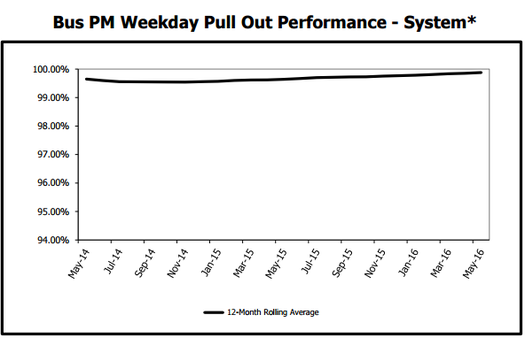 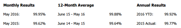 Sure, you could zoom the chart in even more, but it still would not communicate what the difference between 99.8% and 99.9% is. Let us take a closer look at an MTA metric around the percent of required buses and operators available in the AM peak period.(Pictured above) (Note they say "required", not "scheduled") It is a metric to ensure that the minimum/required amount of service is available. You have two main factors on why the buses would not be able to go out: No operable bus, or no driver to drive the bus. From the graph above, we can see that the previous 12 month average is 99.8%... Impressive! Displaying the data this way is great to show the awesome performance, but it does a poor job of calling out how to make the process even better. So what is the difference between a process that is 99.8% vs 99.9%? The classic example is the up time your electricity is on. In the United States, we expect it operating 99.9% of the time while some countries are grateful they can have it on for a couple hours a day. Electricity Uptime: - 99.38%: Equivalent to 60 minutes a week of no electricity (Hope you save your work often! -99.87%: Equivalent to 13 minutes a week of no electricity (Not bad, but I cant imagine knowing that we would be on backup power 15 mins every week) - 99.977%: Equivalent to 10 mins a month of no electricity.(This is probably normal, summer storm knocks power out for 2 hours on a mid august day, that is still a 99.977% uptime for the year. - 99.99966%: Equivalent to less than 2 minutes a year of no electricity. So we can easily see that there is no way I am accept a 99.4% success rate of electricity transmission, let alone 99.87%. I want to see MULTIPLE 9's. ANSWER: USE PROCESS SIGMA of 1 through 6I will let the pros explain what Process Sigma is: https://www.dmaictools.com/what-is-six-sigma/sigma-level/ When we look at the Bus metric and see the capability of dispatching the required buses continuously approaches 99+%, we should convert that to a Process Sigma rating of 1 through 6. Here is the conversion table at a high level: 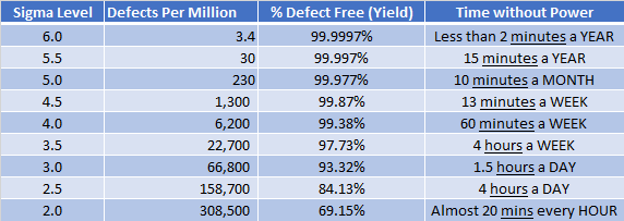 Now we can have a much more dynamic looking graph as well as easily see a difference when we are talking about 99.87% (4.5) vs 99.997% (5.5). Here is the same Bus Chart converted to Process Sigma numbers: I also like to tell my audience that if you see a process that is 1.0 sigma values different, then THAT IS A HUGE DIFFERENCE. 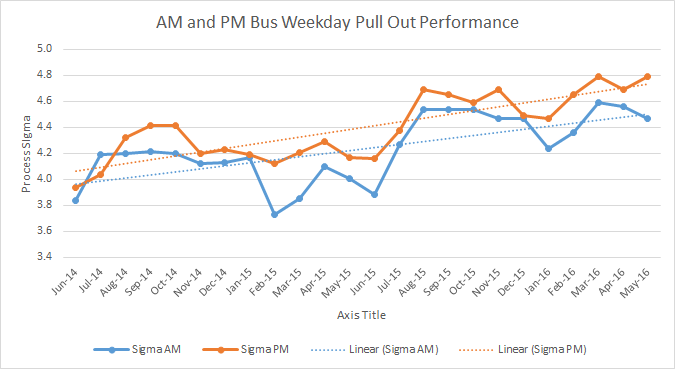 ****Yes, of course your can keep zooming into the original graph to get the same shape as the Process Sigma, but the shape is not the point, The point is to simplify the true capability of the process and work towards improving towards the next Sigma Level. Seeing something that is 3.7 vs 4.5 is much easier to grasp than something that is 0.0002 different than the other. To determine your performance, you need to set a goal as to what the process capability should be. Is 4 Sigma our goal or should we strive for 5 Sigma. Remember, the difference between the two is so small on an absolute scale (2.7^-5) yet from a large operation you are talking about an extra 6,000 defects per million. Data Source:
http://web.mta.info/mta/news/books/
#7TrainBlues
Ever wonder where all the exits and entrances are for the 7 train line? Here you go: http://web.mta.info/developers/data/nyct/subway/StationEntrances.csv Just Kidding, I made it easier for everyone:
As a new New Yorker, I find it intriguing how upset some individuals get if the subway is delayed 5 minutes. Yes, 5 minute delay at Grand Central waiting for the 7 train in afternoon rush hour can look like the end of times with so many people on the platform. Back in St. Louis rush hour scheduling was one train every 12 mins! So let us all take a step back and appreciate how large of a public transit city we are and the scale of how big our MTA transit system is when compared to some other cities and and modes of transit: First we should understand the size of other public transportation entities by focusing on the amount of passengers they carry PER YEAR. **The following numbers include Rail and Bus passengers Amtrak vs DC Transit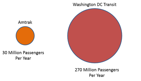 Even combining those two entities: they are still too small to even make a comparison to the MTA. Let us add some more Transit Systems throughout the United States (Top 7). 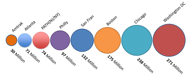 Top 7 US Public Transport System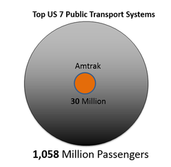 We are getting closer now, but we still need more entities to get a good comparison to the MTA. Top 10 World Wide Airlines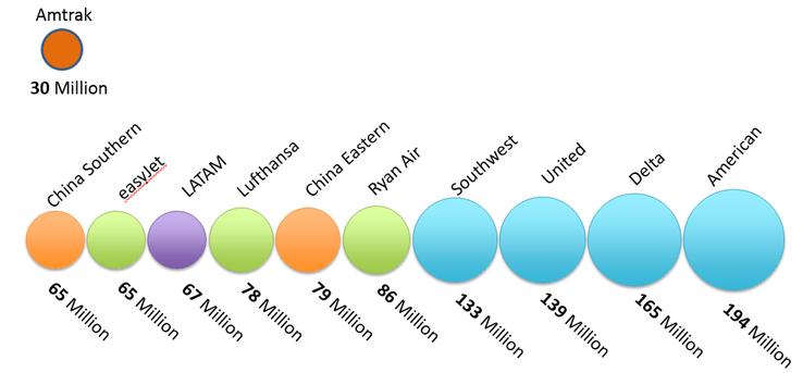 Now that we have a better understanding of how big the largest US transit systems are well as the largest world wide airliners, we can now compare them to the MTA. 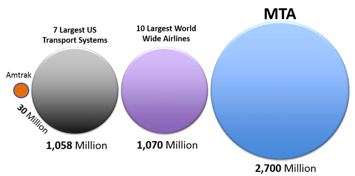 The MTA still moves over 25% more passengers than the Largest 10 world wide airlines and Largest 7 US Transit system COMBINED.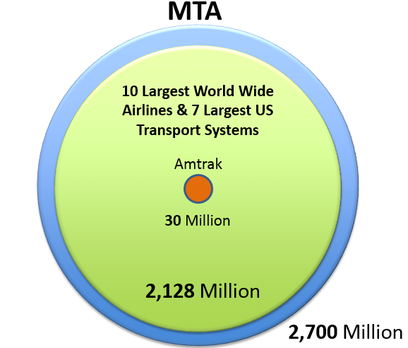 And that does not even include all the cars, buses, trucks that travel through the 7 MTA Bridges and 2 Tunnels! A round trip ticket for New York City residents while factoring in minimum wage increases and access to the new Commuter Benefits program is probably the cheapest it has been in over 4 decades.
Here is the BIG picture below based on the following assumption:
here has been some extremely favorable factors that have reduced the TRUE COST of a round trip ticket.
1. Minimum Wage Yes, Minimum Wage in New York City has been very well positioned to combat any increase in Metro Card prices. In the above interactive report; the two graphs on the far right side show the similar increase in both pay and metro car prices. This is showing that inflation/minimum wage is keeping up with the basic cost of public transportation. 2. MTA Metro Card BONUS The Bonus was introduced back in 1998 with a 10% bonus when spending $15.00 or more. You can see from the table below that the MTA has played around with the % bonus as well as the minimum purchase amount to obtain that bonus. This year the equation changed and is one of the most favorable bonus allocation ever: 11% when you buy a round trip ticket. 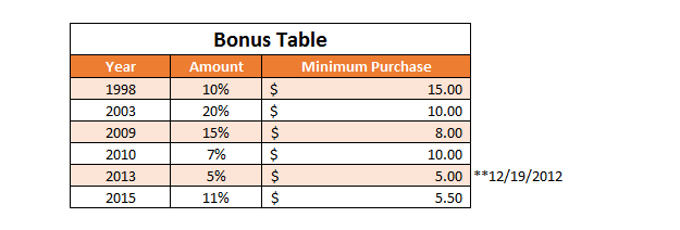
History of MTA Bonus Table
3. New NYC Transit Tax Deduction
In 2015 NYC requires employers with 20 or more full time employees to offer pre-tax earnings to purchase transit options. (http://cdn2.hubspot.net/hubfs/383308/NYC_Local_Law_53-1-1.pdf) For those of you in the minimum wage bucket: State Tax: 4.5% / Federal Tax: 15% / City Tax: 3.5% That is an additional 23% savings, and if you are higher up in the tax brackets, we are talking 40% off your metro card. *An ironic side affect of the commuter benefit program is that it takes away a small chunk of tax dollars away from New York City and thus allows for less money to be invested in public transportation. ooppsss
References:
Metro Card and bonus Rates: http://web.mta.info/mta/investor/pdf/2015/AppendixASupp51215.pdf Minimum wage: https://www.labor.ny.gov/stats/minimum_wage.asp Commuter benefits: http://cdn2.hubspot.net/hubfs/383308/NYC_Local_Law_53-1-1.pdf |
Fav ToolsPowerBI Archives
April 2018
Categories |


 RSS Feed