|
Answer: Very Background: The MTA sent out letters to some NYC employers asking them to let their employees have flexable work hours to avoid the "Summer of hell." http://nypost.com/2017/06/12/this-might-be-the-mtas-dumbest-solution-for-summer-commuters/ The idea is good, but the execution lacked hard evidence of when / where / why the employer should allow flexible schedules. I needed to brush up on my Six Sigma training and found a dataset that would be good practice on as well as provide an example of how data could help riders at least AVOID the peak of the hellish summer. What you see below is the:
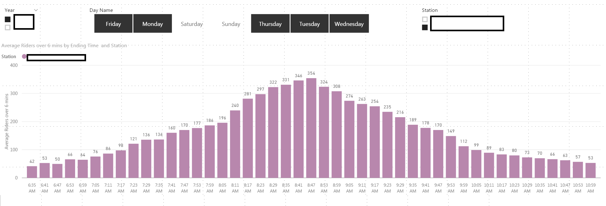 So this specific station on average has the highest number of people coming into the station at between 8:42AM and 8:47AM. Now the next question should be: "What is the distribution of riders for this specific period of time over the year being analyzed?" Is that specific 6 minute interval normal as well? Here it is: 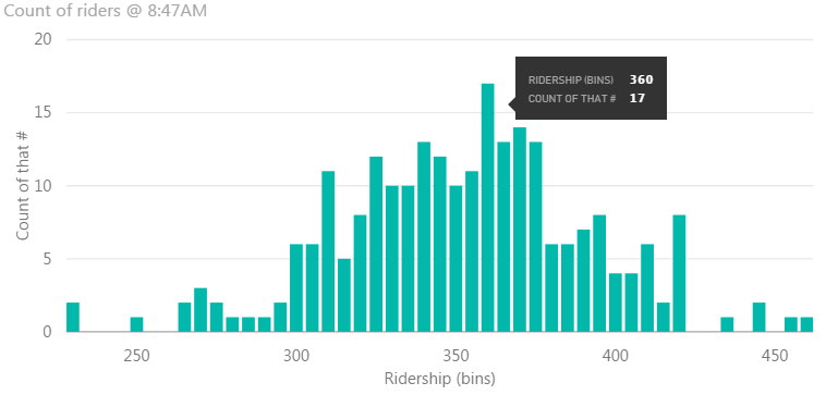 So over 240 data points for the year are recorded above. Remember, we are not including weekends and holidays which is why there is not 365 data points. We can see that 360 riders came through this 6 minute interval the most number of times at 17 times. Overall, I would say the data is pretty normal; most data points are clustering around the mean of 355.
So what can we now do with this? Well thanks to the normal data, we can utilize some basic statistics and figure out Variability and Confidence Intervals:
Next blog I will document what DAX formulas helped me accomplish this. |
Fav ToolsPowerBI Archives
April 2018
Categories |
 RSS Feed