|
Since 1968 (Official consolidation of New York City transit services) there have been 12 MTA Chairman, which means only average each one served 4.1 years. Since 2007, the average has been 2 years! 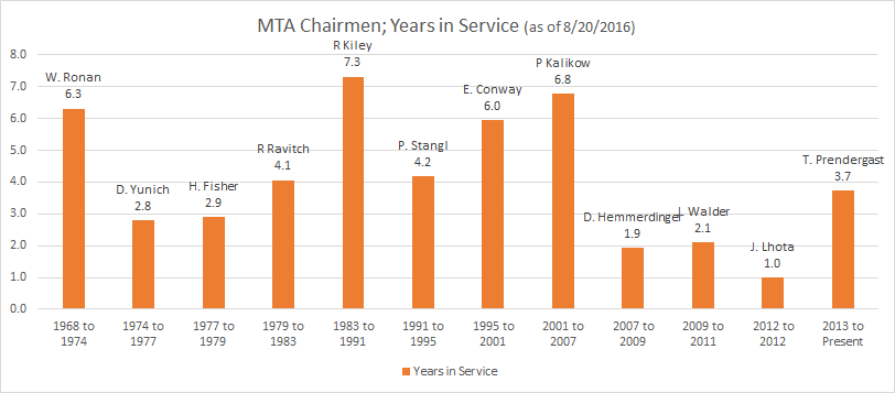 Poor J. Lhota: 1/9/2012 through 12/31/2012. He probably was not even able to witness a Purchase Order go through and see it delivered.
Being the CEO at the MTA, is very different than being a CEO for a Public Company. The primary reason is because the MTA Chairman is the position that links all of the operating agencies together (LIRR, MNR, NYCT, MTA Bus, Bridge and Tunnel). Without the chairman, there can be no consolidation of operations and effecienies. In 2016, the MTA is finally starting to combine procurement offices; no one needs 5 different people buying pens and pencils from 5 different vendors. So when you have that kind of turnover over a 5 year stretch from 2007 through 2012, you have delayed that process of trying to get everyone on the same page. Thankfully the current CEO, Tom P. has been in the position for over 3 and half years (plus decades running other transit operations) and the NY Governorship will not be changed until 2018 which means Tom should be able hit 6 years in the position and provide much needed continuity to the MTA as well as push long term projects that would not be possible with leaders that last only 1 to 2 years. I have seen a couple of examples where industries or departments show a KPI where it always hovers around 99.7% to 99.9%. Almost all the time the KPI chart will look like this: 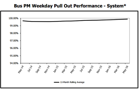 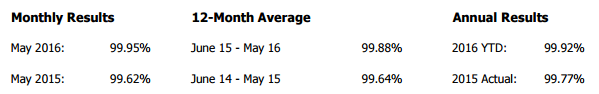 Sure, you could zoom the chart in even more, but it still would not communicate what the difference between 99.8% and 99.9% is. Let us take a closer look at an MTA metric around the percent of required buses and operators available in the AM peak period.(Pictured above) (Note they say "required", not "scheduled") It is a metric to ensure that the minimum/required amount of service is available. You have two main factors on why the buses would not be able to go out: No operable bus, or no driver to drive the bus. From the graph above, we can see that the previous 12 month average is 99.8%... Impressive! Displaying the data this way is great to show the awesome performance, but it does a poor job of calling out how to make the process even better. So what is the difference between a process that is 99.8% vs 99.9%? The classic example is the up time your electricity is on. In the United States, we expect it operating 99.9% of the time while some countries are grateful they can have it on for a couple hours a day. Electricity Uptime: - 99.38%: Equivalent to 60 minutes a week of no electricity (Hope you save your work often! -99.87%: Equivalent to 13 minutes a week of no electricity (Not bad, but I cant imagine knowing that we would be on backup power 15 mins every week) - 99.977%: Equivalent to 10 mins a month of no electricity.(This is probably normal, summer storm knocks power out for 2 hours on a mid august day, that is still a 99.977% uptime for the year. - 99.99966%: Equivalent to less than 2 minutes a year of no electricity. So we can easily see that there is no way I am accept a 99.4% success rate of electricity transmission, let alone 99.87%. I want to see MULTIPLE 9's. ANSWER: USE PROCESS SIGMA of 1 through 6I will let the pros explain what Process Sigma is: https://www.dmaictools.com/what-is-six-sigma/sigma-level/ When we look at the Bus metric and see the capability of dispatching the required buses continuously approaches 99+%, we should convert that to a Process Sigma rating of 1 through 6. Here is the conversion table at a high level: 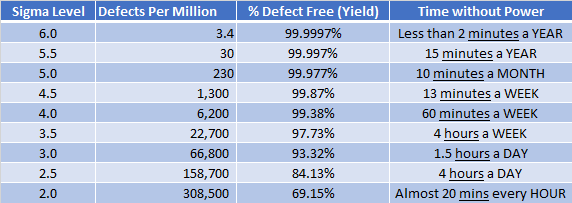 Now we can have a much more dynamic looking graph as well as easily see a difference when we are talking about 99.87% (4.5) vs 99.997% (5.5). Here is the same Bus Chart converted to Process Sigma numbers: I also like to tell my audience that if you see a process that is 1.0 sigma values different, then THAT IS A HUGE DIFFERENCE. 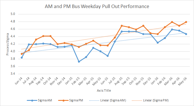 ****Yes, of course your can keep zooming into the original graph to get the same shape as the Process Sigma, but the shape is not the point, The point is to simplify the true capability of the process and work towards improving towards the next Sigma Level. Seeing something that is 3.7 vs 4.5 is much easier to grasp than something that is 0.0002 different than the other. To determine your performance, you need to set a goal as to what the process capability should be. Is 4 Sigma our goal or should we strive for 5 Sigma. Remember, the difference between the two is so small on an absolute scale (2.7^-5) yet from a large operation you are talking about an extra 6,000 defects per million. Data Source:
http://web.mta.info/mta/news/books/
#7TrainBlues
Ever wonder where all the exits and entrances are for the 7 train line? Here you go: http://web.mta.info/developers/data/nyct/subway/StationEntrances.csv Just Kidding, I made it easier for everyone:
|
Fav ToolsPowerBI Archives
April 2018
Categories |
 RSS Feed